Borders for Chalkboards
A guide for using borders to make chalkboards stand out

A chalkboard in front of a store is usually trying to sell something, be informative, or promote an event. Sometimes they are eye catching, but sometimes they are too busy and illegible or even just boring and not informative enough. You’ve definitely seen those, right? There are so many ways to improve chalkboard signs and one of those are with decorative borders.
(Feel free to skip this part and go straight to the pictures.)
Awhile ago, I made an embarrassing comparison about how borders are like eyebrows. I never really explained myself but basically it’s this: People notice when you don’t have eyebrows. It’s all they can see because something seems incomplete. You can have a beautiful smokey eye and eye-catching lipstick but no one can tell because all they can see is what’s missing. When you add eyebrows, then no one notices JUST your eyebrows, they see the entire look as a complete composition. Okay, enough about eyebrows. Basically, borders aren’t the center of attention, they play a supportive role, they are the unsung heroes of eye-catching chalkboards. Of course you don’t NEED borders every time, but they will most definitely step-up your chalk game and have clients come to you again and again for new chalk work.
Just a few guidelines first:
Below I’ll show you examples of how borders make a huge difference and how to use them using several signs that I made just for this blog. But first, there are a few guidelines that I follow when choosing a border. Keep these in mind when applying your own creative borders.
Opposites attract. A border should complement the message in size. Let’s say you have a lot of information to display. Excess information needs a small or clean border in order to avoid cluttering. Light informative can have a dramatic, colorful border.
Use Colors With Intention. If your border has color, try to stick with a neutral color for the message. For example, if I made a chalkboard for Starbucks, I would use white for message and add a green decorative border with those swirls that are in the logo. The message is still the most important and the border is a supportive role. But if you did want to create your message with color, make sure you use a border with a color from your palette or a softer color that doesn’t over power your message.
Consider the frame. This one is simple. Some chalkboards have a gold frame, some have black, red or even multi-colored. I don’t use a border if the chalkboard frame is already dramatic and bold. It’s just too busy in my opinion. If the frame is red or green, don’t use a colored border that clashes because then it just looks tacky.
Borders are guides too. They are used to isolate information, organize information, or to catch your audience’s attention a lot faster. I just want to emphasize that you don’t always need a border but they are important for menus that have various categories. Borders make it easier to read and follow. I like to say that a menu is like a story; you want to manipulate which part the customer reads first and which part they see last, or for them to able to find their favorite item quickly.
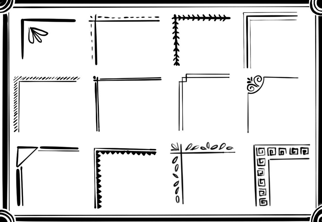
My Go-To Borders
(All of these boards are made up, these businesses and logos don’t really exist.)
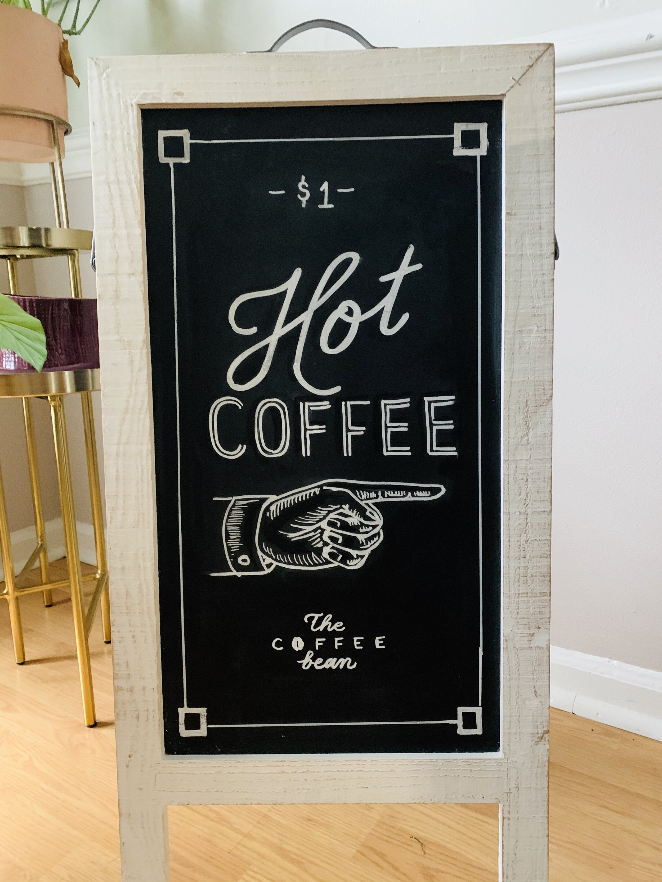
The Classic Coffee Chalkboard I love playing with a simple border for coffee chalkboards. It gives it a clean and approachable personality. Here are some examples of coffee sign borders. You might say, “But I like the original as it is.” It does look fine but adding a simple border doesn’t hurt this sign, it just enhances it and shows more effort.


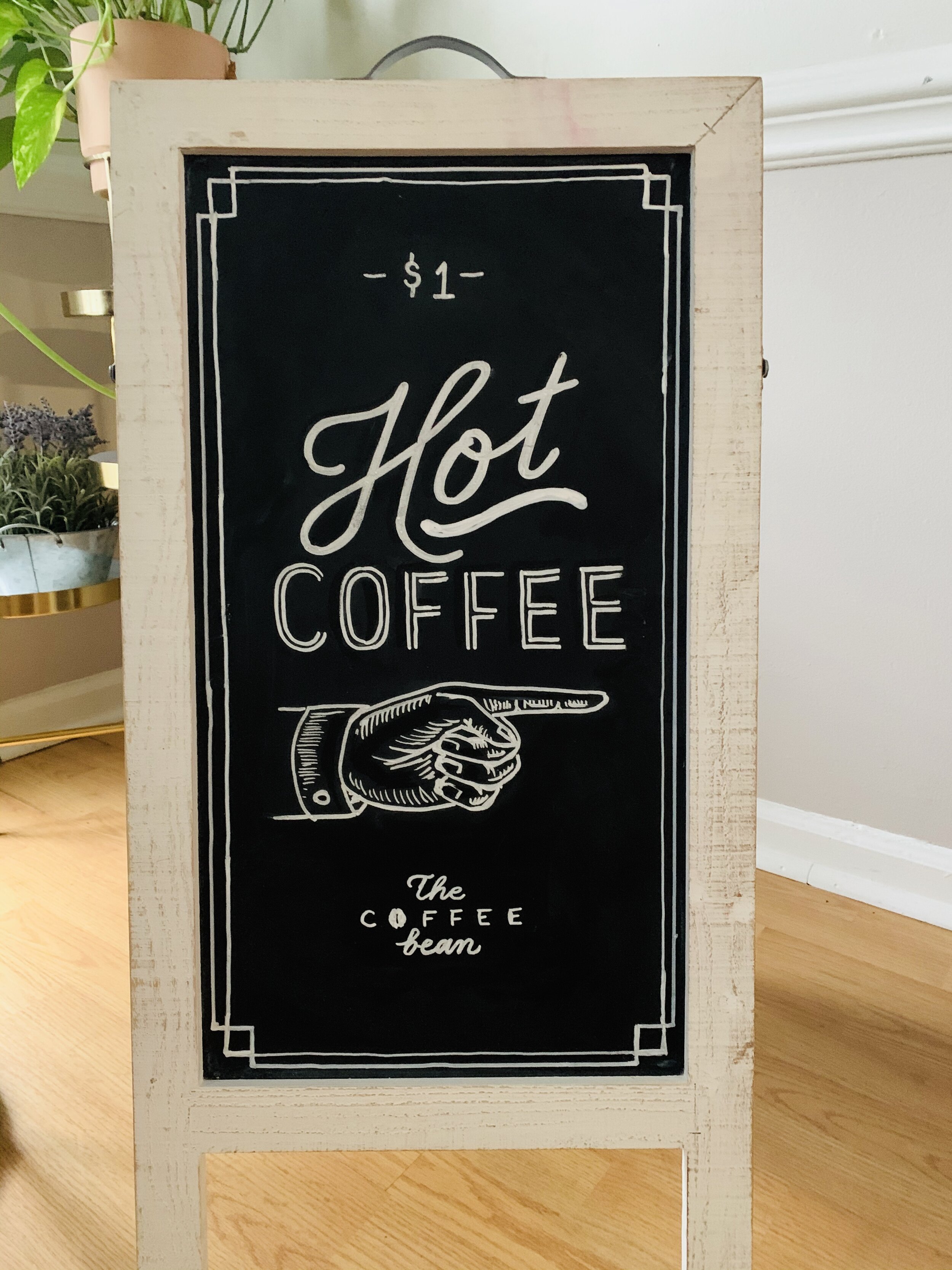
I went ahead and doodled a few more ideas for simple borders that would also work for that clean, classic look. Feel free to use these!
Florals and Leafery Use this border style for appropriate signs like weddings, seasonal promotions, a charming restaurant with THAT vibe (You know, VSCO girl or super fancy or do-it-for-the-gram kind of places. I love those places tbh.) Also use them for a more feminine audience, formal events, etc.

This sign is perfectly fine but it lacks eye catching detail or a personality to catch the attention of a customer walking by the store front. It’s almost empty and demanding.

By adding these florals, it claims the personality of spring charm and happiness. The look is welcoming and friendly. Perhaps the store logo has a rose concept. You can use any flowers and colors to match the store.
The Color Statement Border I love this style because the color is loud and it pops, but it’s still balanced enough to show you the signage. Definitely use these when the information is light. Your board could get very crowded with a thick border and lots of information to show. These work for signs that just show the business name or a very quick menu such as this one below.

This sign has the logo and a short menu, but it feels very empty and shows very little effort to catch a customer’s eye right away.
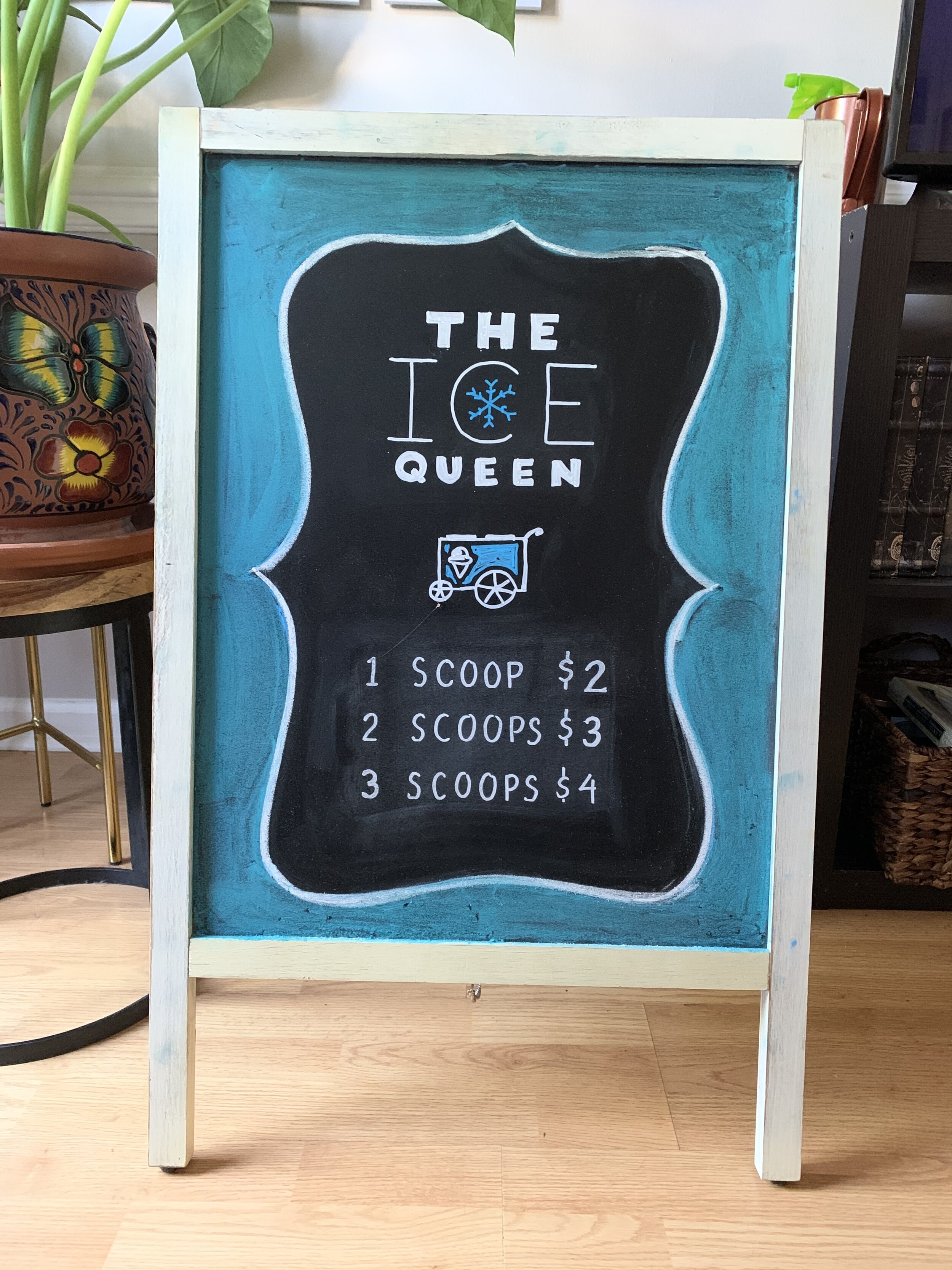
This big border creates a huge statement, it catches the eye and centers it immediately to everything inside. There’s no more empty boring space. The color matches the brand and brings it together for a complete look.
Art Deco This border style definitely has a time and place. You probably shouldn’t use it for a sports bar chalkboard for example, but definitely for a classy bar, a nice restaurant, or even an art deco themed wedding. There are so many ways to create art deco borders and I recommend starting on pinterest for more ideas. Here is how this border changed the vibe of this speakeasy chalkboard sign.

This is a sign that would be at the host stand for guests to see right away. Once again, this one is just bland and empty. But there is a good bit of information to read so the border shouldn’t be too thick.

This border helps set the tone of the restaurant, since it could be the first thing guests see when they arrive. It also complements the ambience of the restaurant and gives the board a complete look. I used gold which is still a visible accent to this board but doesn’t steal from the important information.
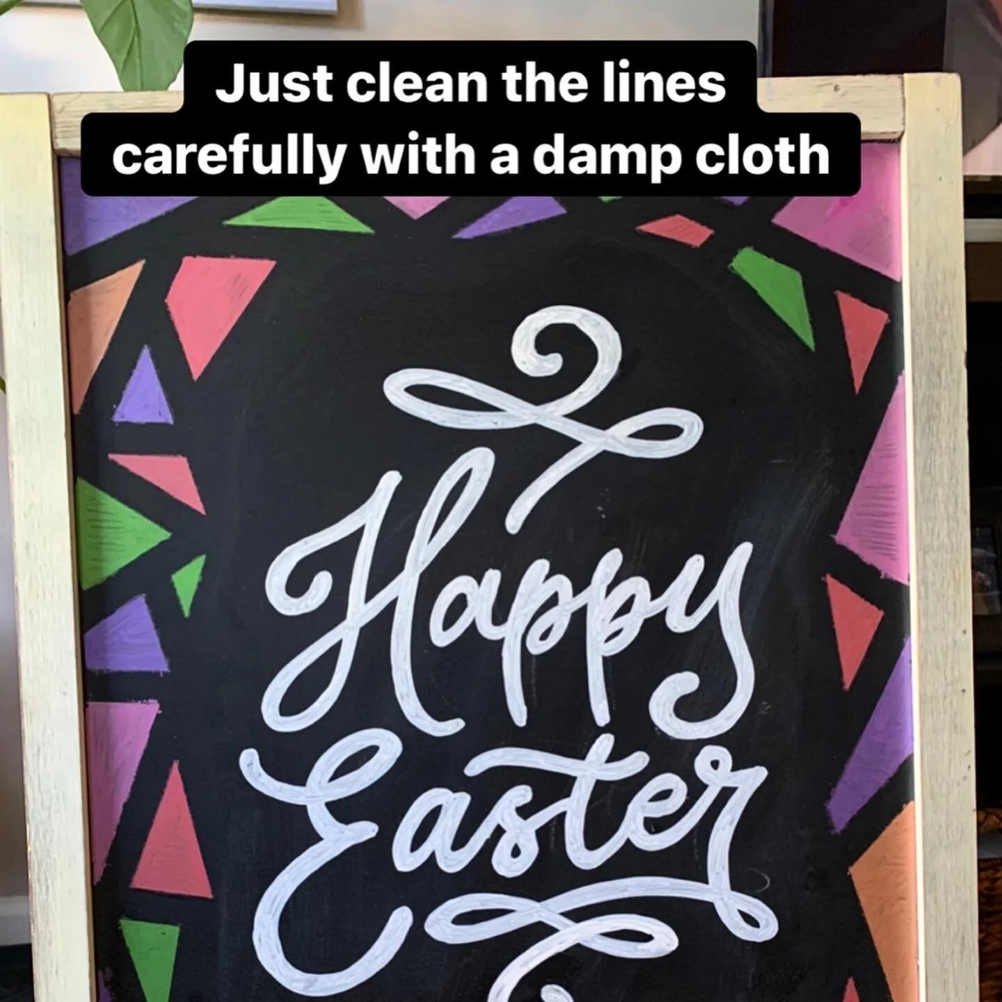
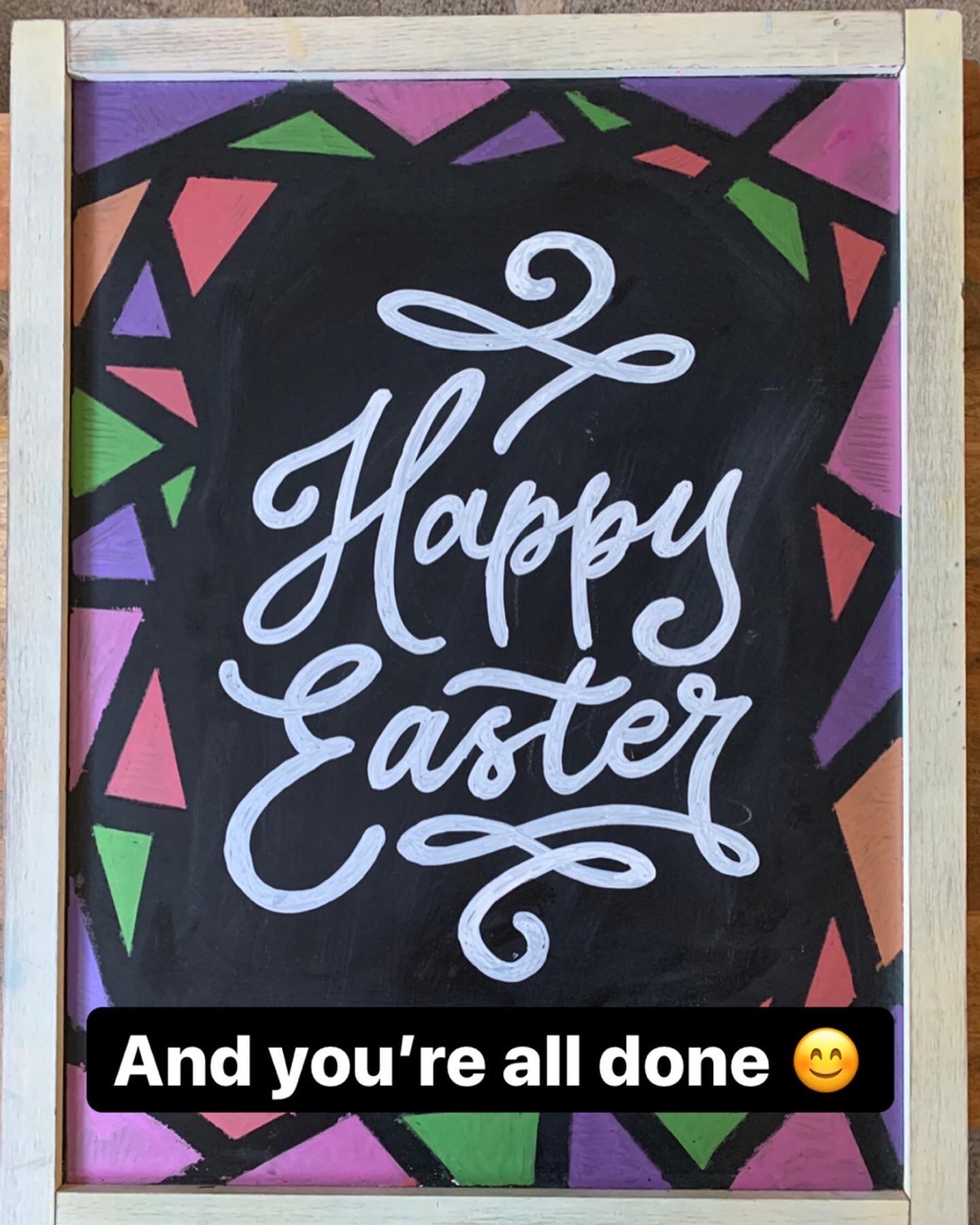
Fun and Geometric This border takes a few extra steps, but I guarantee it is easy and makes the board impressive. I picked a pastel metallic palette because my sign was about Easter. This is when color is definitely a must. Holidays and special themed events have set colors to create an instant mood. Because I used so many colors, I kept the message white. However, I think a few of the border colors would’ve been ok to highlight some of the lettering, like a drop shadow for example.
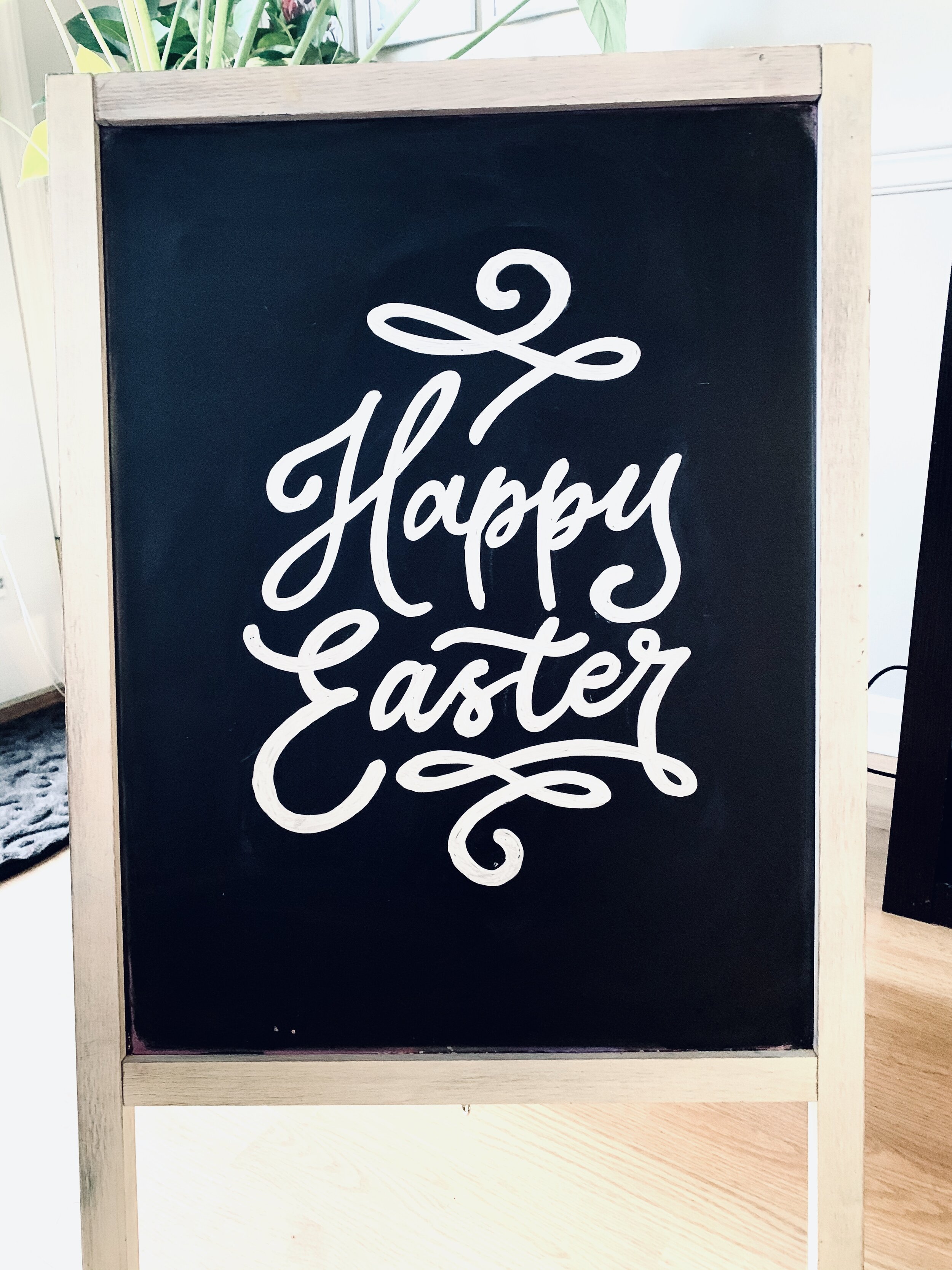
There is lots of empty space. Easter is a colorful a and cheerful holiday. You could even create a border out of colorful eggs. There is so much possibility here.

This border makes a clean and colorful statement. It even almost resembles stained-glass windows. See the tutorial below on how to create this border.


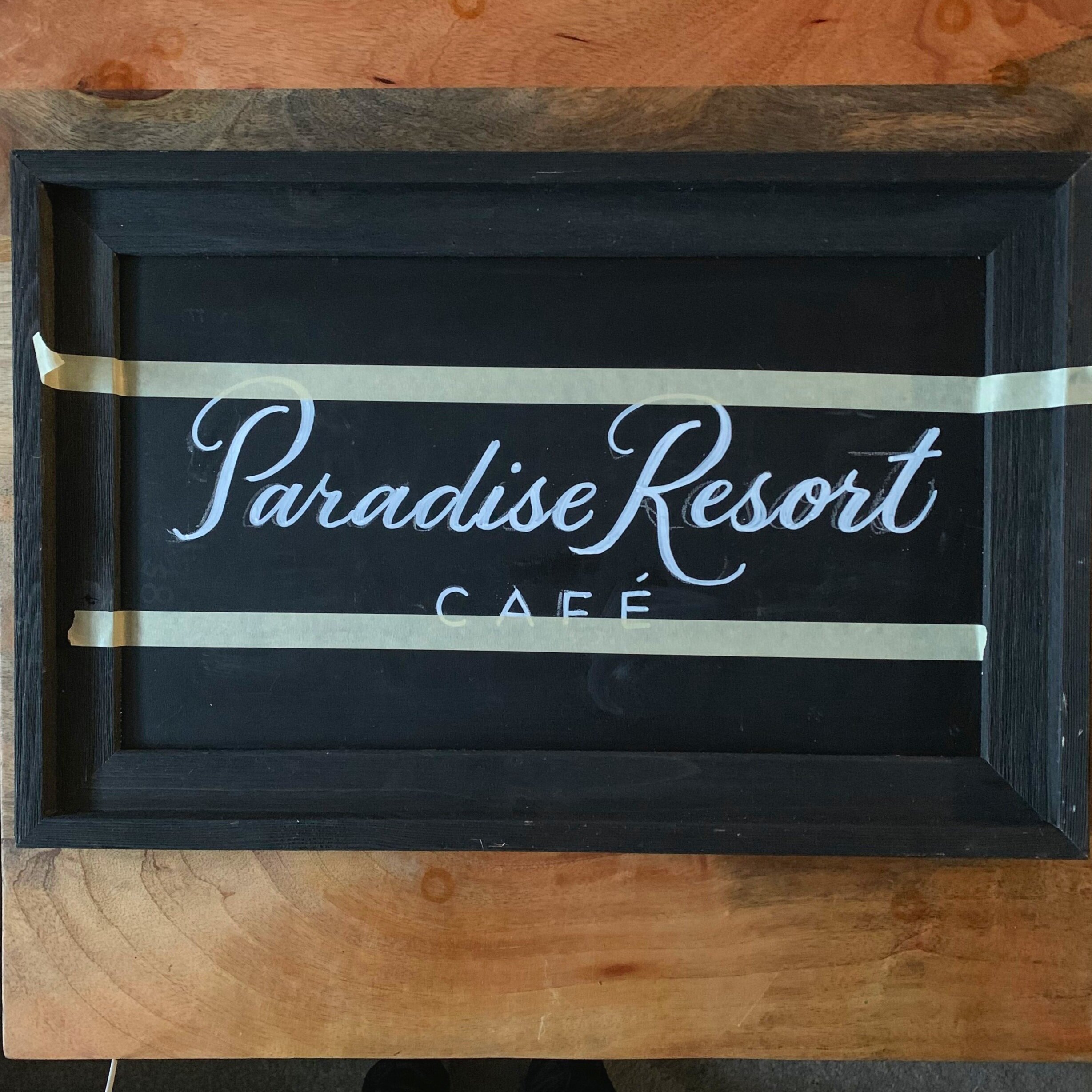
Only Half of the Border Using only two opposite sides for a border can also be a statement. In this case, I used only two sides because of the size of the board. It was small and horizontal. It only needed the name so I wrote the name first then added two strips of tape to my desired thickness of the border. You have to wait for the other chalk work to dry or else you may ruin the work you just did. I filled in the border spaces with tropical leaves since this was a resort. I used a dark forest green so that it showed but didn’t contrast or clutter the name.

Elaborate Corners These are fun but can also be a clutter if not used properly. I decided to use this border for a short menu. I imagined this restaurant was a semi casual spot with a touch of flare. So I used a metallic pink border to decorate the menu with some elaborate corners. You can also find a variety of these for inspiration on pinterest. In order to not over do the corners, I like to connect them with a simple line. Of course, I kept contrast in mind by keeping the information simple, clean, and easy to read because it’s a small menu and guests need to be able to read it if they’re further away than others.

Before a border, it is just simple, boring, and not very exciting to look at.
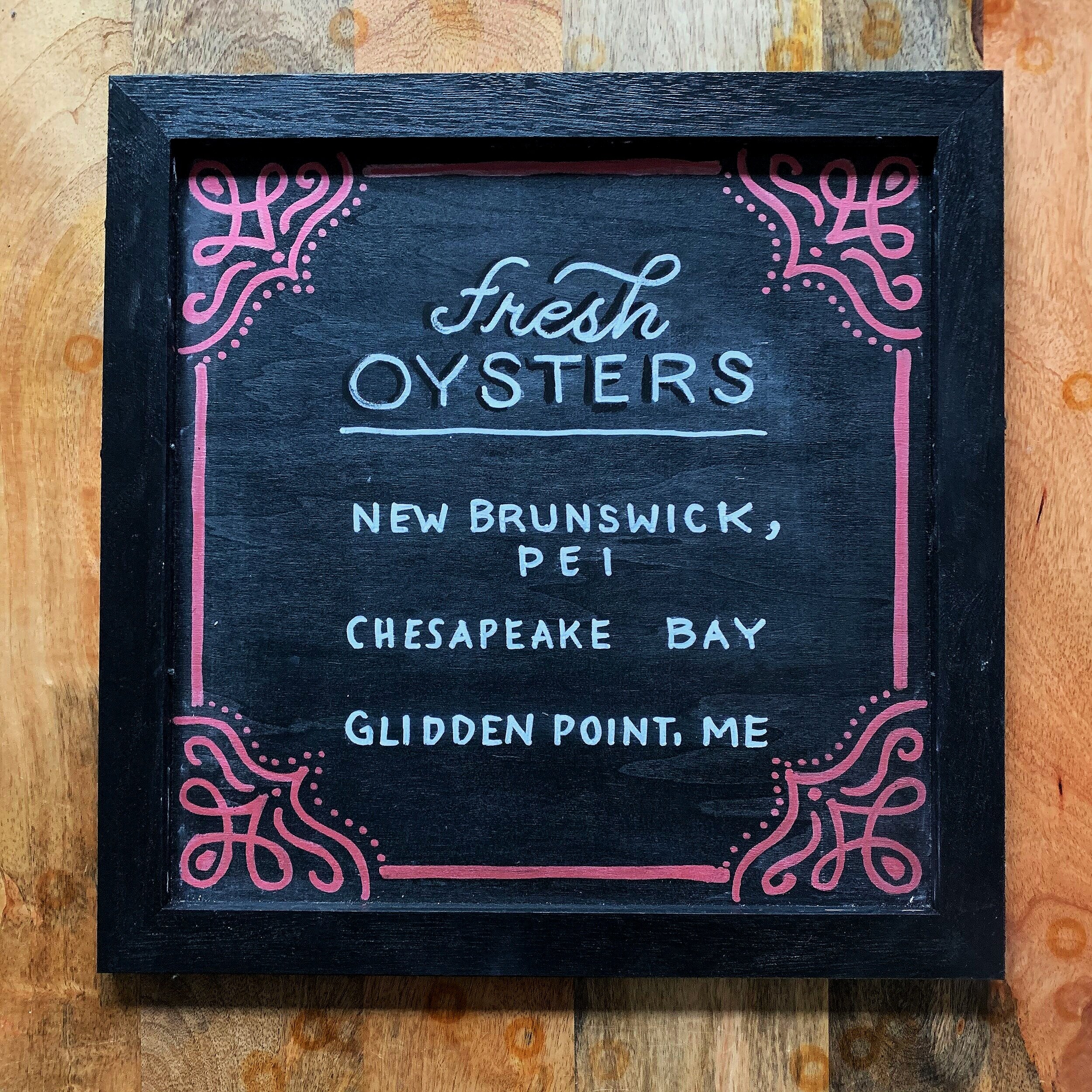
But these statement corners gave it a personality and an appearance of casual elegance. (That’s really a thing for me, haha) And even better, the corners are acting as an arrow leading the eye straight the content. Just subtle eye manipulation that you don’t notice is happening. Let them work for you! The color statement was specifically chosen to match the vibe and brand of this fictional restaurant.
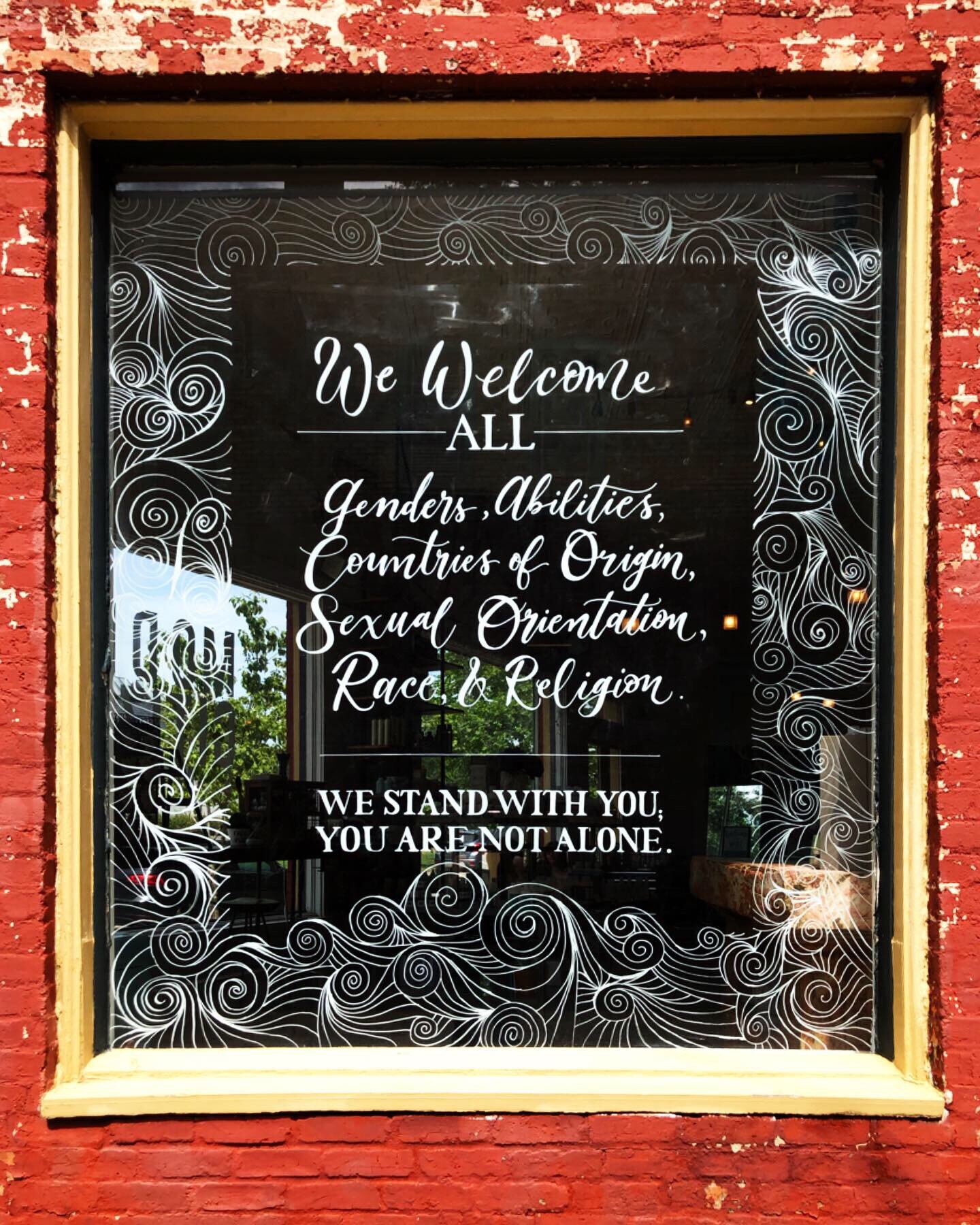
Waves of Noodles I love love love this border. I may be saying that about all of them so far but this one really makes an amazing difference. It is a little tricky to do but with practice, you can do it without even thinking. It’s even therapeutic. This could work for any chalkboard subject honestly, but it’s even more effective for a noodle spot. I’ve also used this for the Model Citizen hair salon window because flowing hair (The first picture at the top of this post). It can be used as water waves or just a color pop. Alternate with various colors in this look or even pull off a rainbow of waves. This one is fun!

It’s very boring without the border. The information is light and leaves for too much empty space.

This border is a huge improvement by creating an artistic supportive role to make the message pop. It’s eye-catching, it’s clean, and it looks like there was great effort into creating this board.
Creating this look:
I taped the sides first and then starting filling in curved lines imitating waves but always meeting into one point. Each wave moves in contrasting directions for the whole effect. After filling in all sides, I removed the tape and continued the waves on the top and the bottom but I completed these waves to pop out of the clean lines. This style takes some practice, but once you get into the groove, it it’s so easy to get lost in it. This video shows a quick demonstration.
Simple Line Statement Here’s a quick one. Just draw a line around the border. It really does make a difference. This chalkboard is all black, so this is when I would consider the frame and use color to highlight the border. The color I used though is intentional because it coordinates with the cocktail. Try to keep a nice balance with the colors you choose. (This cocktail is made up, I feel like this would be weird with just lemon, but oh well)

A cocktail special board: you WANT to sell these. It’s a special! So why not make it pop? It’s just a little bland here.
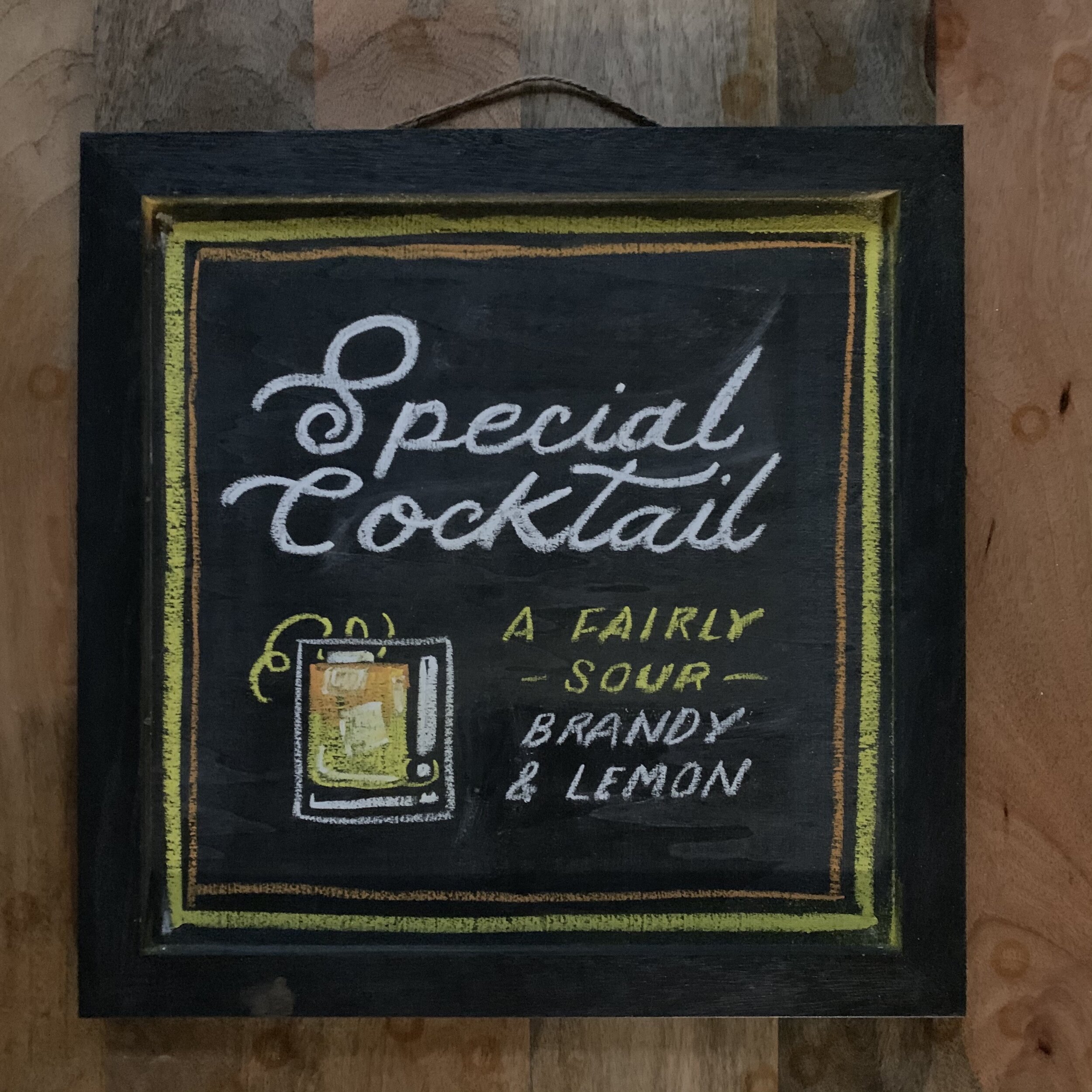
This border is simple. Just a single line. I even went all out and drew a skinnier line inside of it. So little effort BUT it gives this special a focused look. The border works as a highlight or just as extra flare that says, “Hey, look at me! Try this one today, it’s special!”
Holidays This one is a no-brainer. You have full power to use everything about a holiday to decorate your chalkboard. Holidays are festive! Use the holiday themes to really connect with your audience.

I have absolutely no excuse for forgetting the % on this sign but let’s just pretend it’s there. I used the colors of this holiday on this chalkboard. But it’s not festive or selling the mood.

Just a simple holiday decor really completes this sign. I used spider webs, but I could’ve also used flying bats, candy corn, creepy eyes in the dark.. etc! Go crazy with the holiday boards.
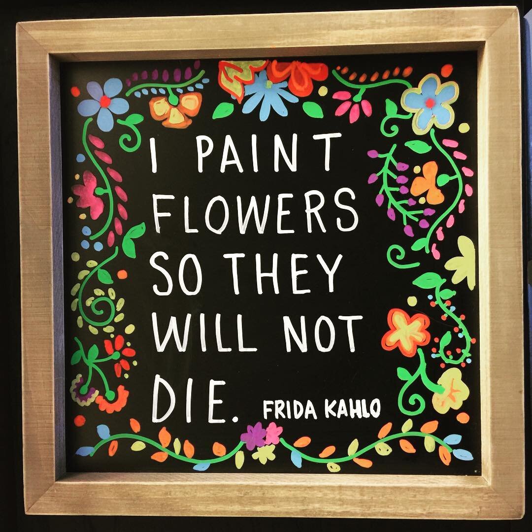
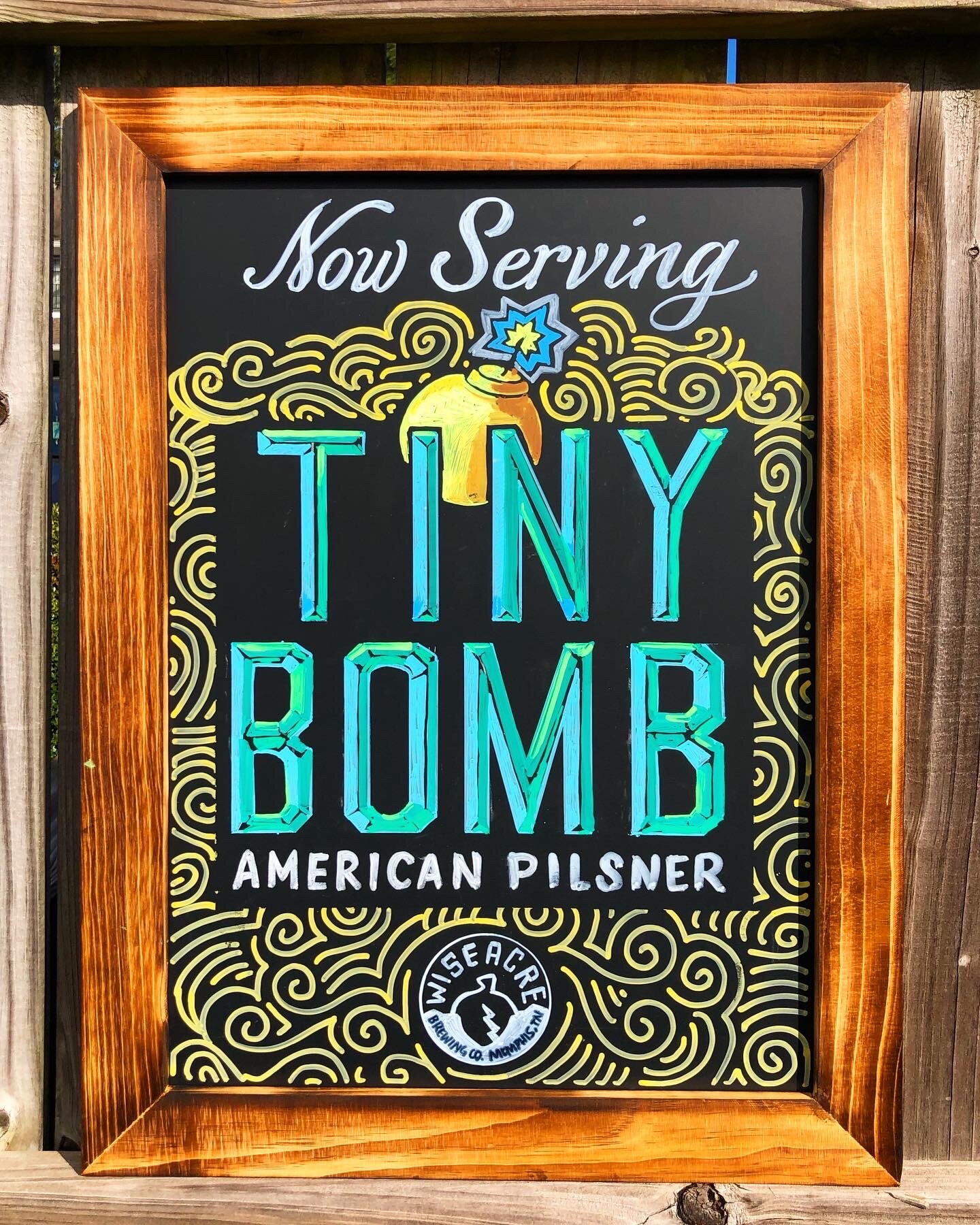
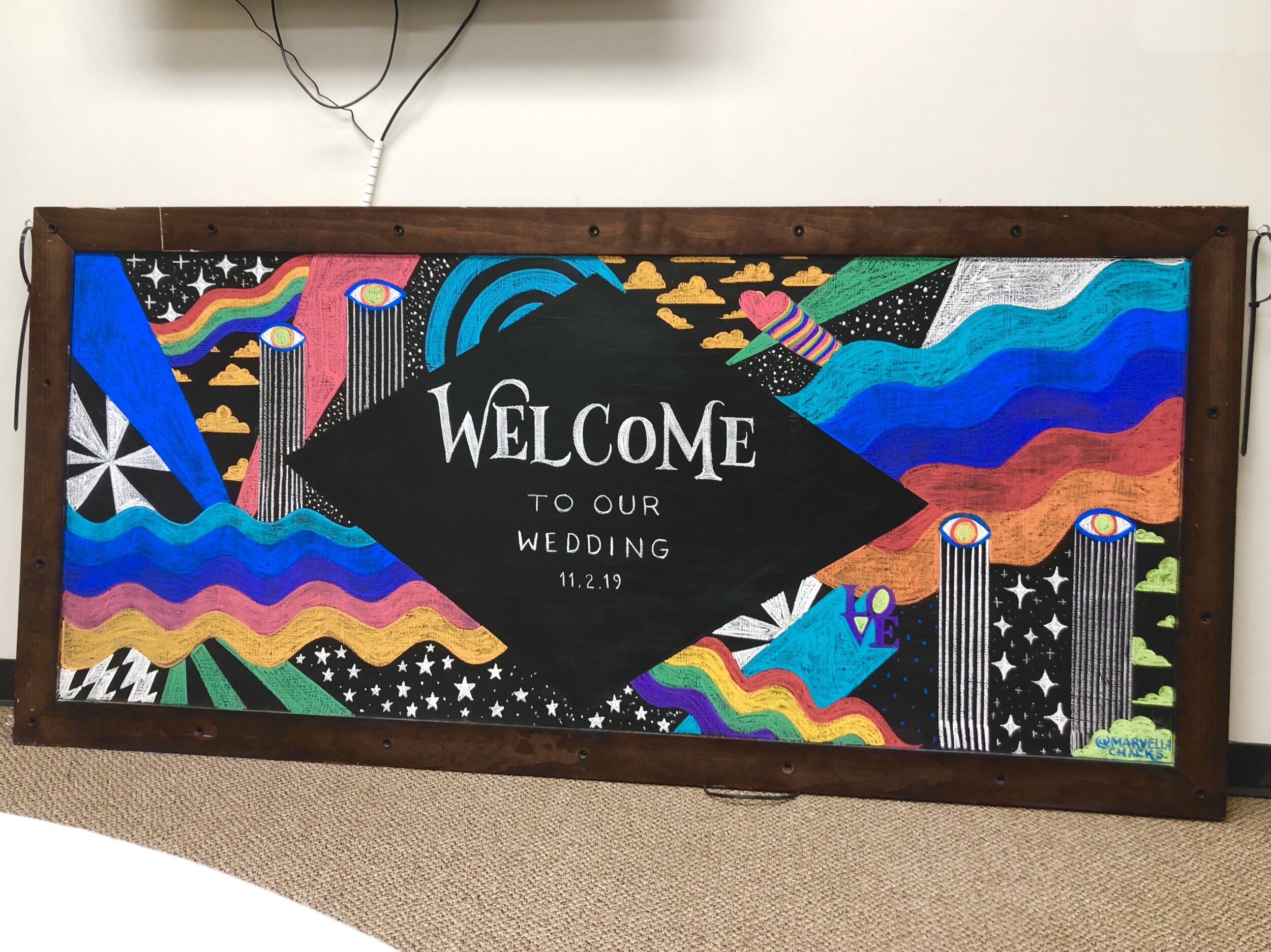
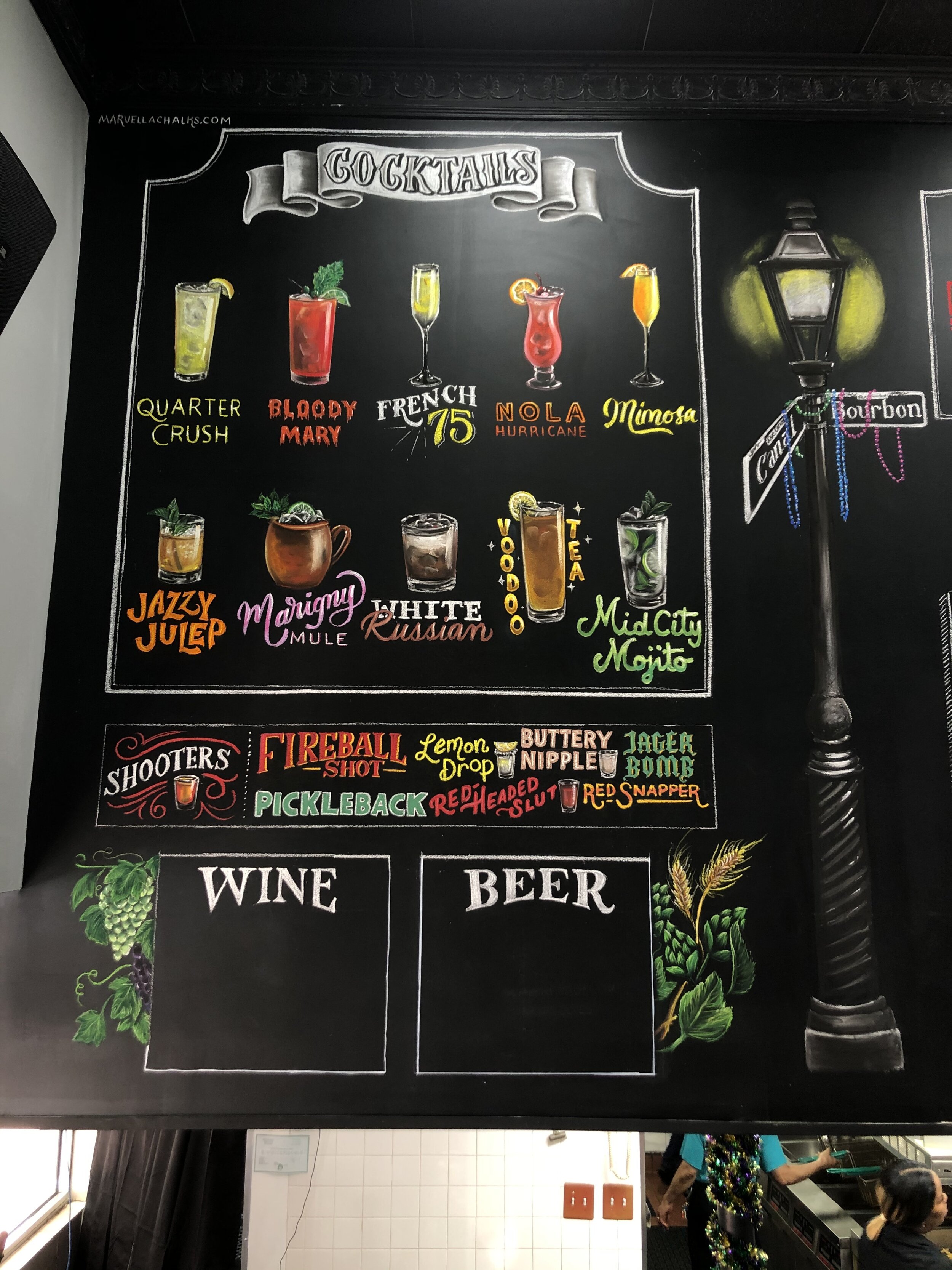
AND LASTLY, I’m just going to post some honorable mentions from borders I’ve used in the past. This includes examples of how I used the above borders and guidelines along with other new ideas. I want this to be your resource for border ideas when you feel stuck, so I’m putting as many on here as possible.
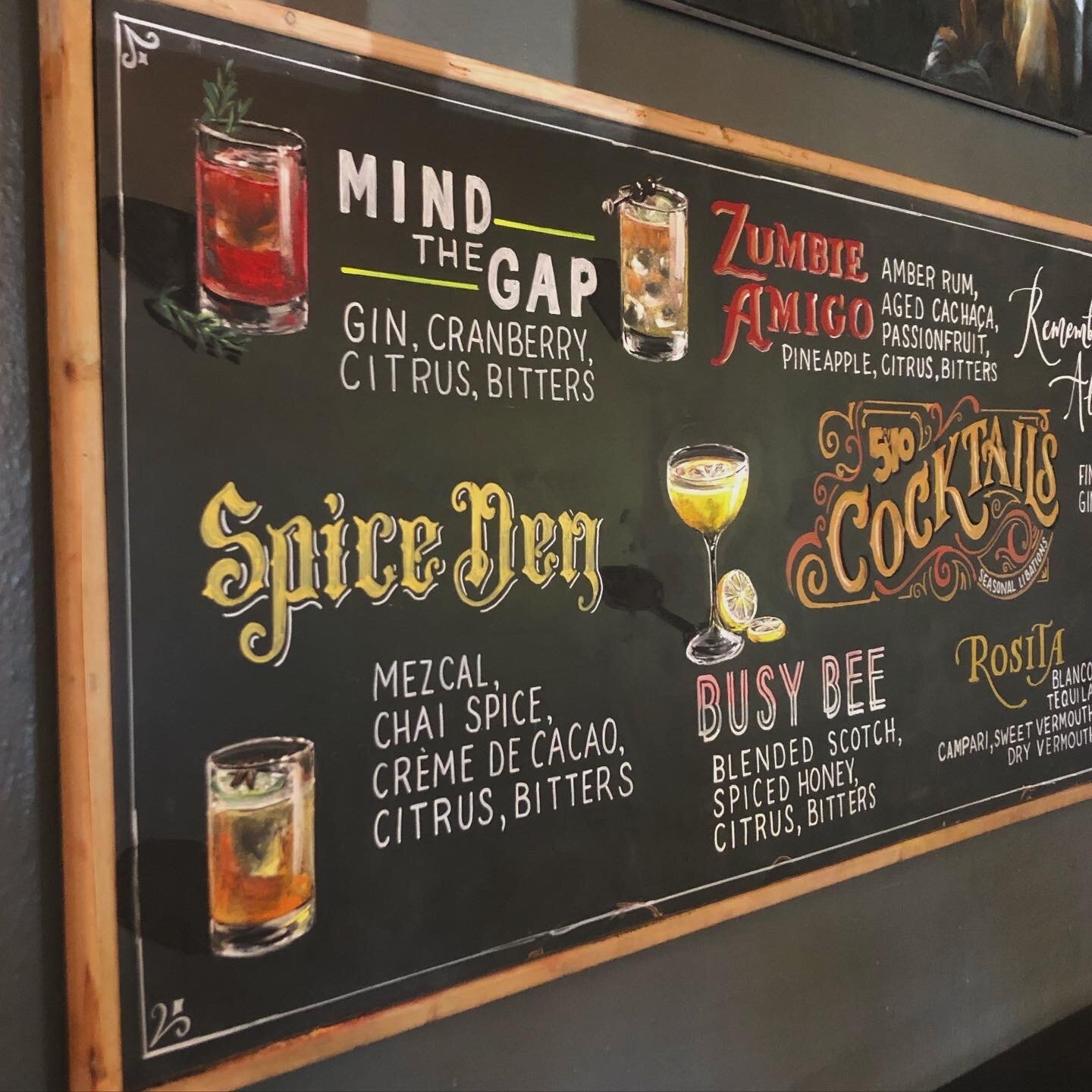


I hope this was helpful! Let me know which border stands out the most to you or which one you are definitely going to try. Definitely use pinterest for more ideas, create a board of your favorites, and also come back here if you want some quick borders to try out.
Thank you for reading and happy chalking!